User profile reimagined

User profile reimagined

User profile reimagined

Main picture
Main picture
Main picture

Timeline

2023 - 2024

Timeline

2023 - 2024

Role

UX/UI Designer

Background

As Lynk & Co's customer base grew, the existing My Pages 1.0 solution became insufficient. It offered minimal self-service capabilities, putting a strain on the Engagement Center to handle tasks customers could potentially resolve themselves. Additionally My Pages 1.0 made it difficult to deliver new functionalities in a way that won't need involvement from devs.

Solution

To streamline the user experience, reduce workload on the Engagement Center and development team, this project aimed to create a modular, flexible, dynamic, and scalable self-service tool for existing and potential customers. This resulted in high-fidelity mockups for a modular self-service platform built with reusable components. 


We also revamped the information architecture and navigation, creating prototypes to ensure clear communication and a development-ready component library

Concept & creation

In the research phase, to optimize the My Pages user experience, we combined approach of heuristic evaluation to identify usability issues, card sorting to improve navigation based on user behavior, and stakeholder interviews to understand everyone's needs. This will ensure a user-friendly and well-rounded My Pages redesign.


Our key findings were:

1

The company was failing to live up to its "hassle-free" promise, leading to a frustrating user experience after conversion

1

The company was failing to live up to its "hassle-free" promise, leading to a frustrating user experience after conversion

1

The company was failing to live up to its "hassle-free" promise, leading to a frustrating user experience after conversion

2

Manual customer support was draining resources. Automation was urgently needed

2

Manual customer support was draining resources. Automation was urgently needed

2

Manual customer support was draining resources. Automation was urgently needed

3

The current version of the User profile section was hard-coded, hindering the dev team's ability to quickly update the platform as new needs arose

3

The current version of the User profile section was hard-coded, hindering the dev team's ability to quickly update the platform as new needs arose

3

The current version of the User profile section was hard-coded, hindering the dev team's ability to quickly update the platform as new needs arose

Card sorting results

To ensure a successful project, we began by clearly defining its scope. This included mapping the "Jobs to be Done" for each user role, identifying their core needs within the project. Finally, we optimized the information architecture to create a user-friendly and intuitive experience that aligns with those needs. Our defined scope was:

1

Reduce user wait times for support.

1

Reduce user wait times for support.

1

Reduce user wait times for support.

2

Alleviate the workload of customer service specialists

2

Alleviate the workload of customer service specialists

2

Alleviate the workload of customer service specialists

3

Build the platform with modular components (instead of hard-coding it)

3

Build the platform with modular components (instead of hard-coding it)

3

Build the platform with modular components (instead of hard-coding it)

4

Empower site editors to handle maintenance and updates, freeing up developer resources

4

Empower site editors to handle maintenance and updates, freeing up developer resources

4

Empower site editors to handle maintenance and updates, freeing up developer resources

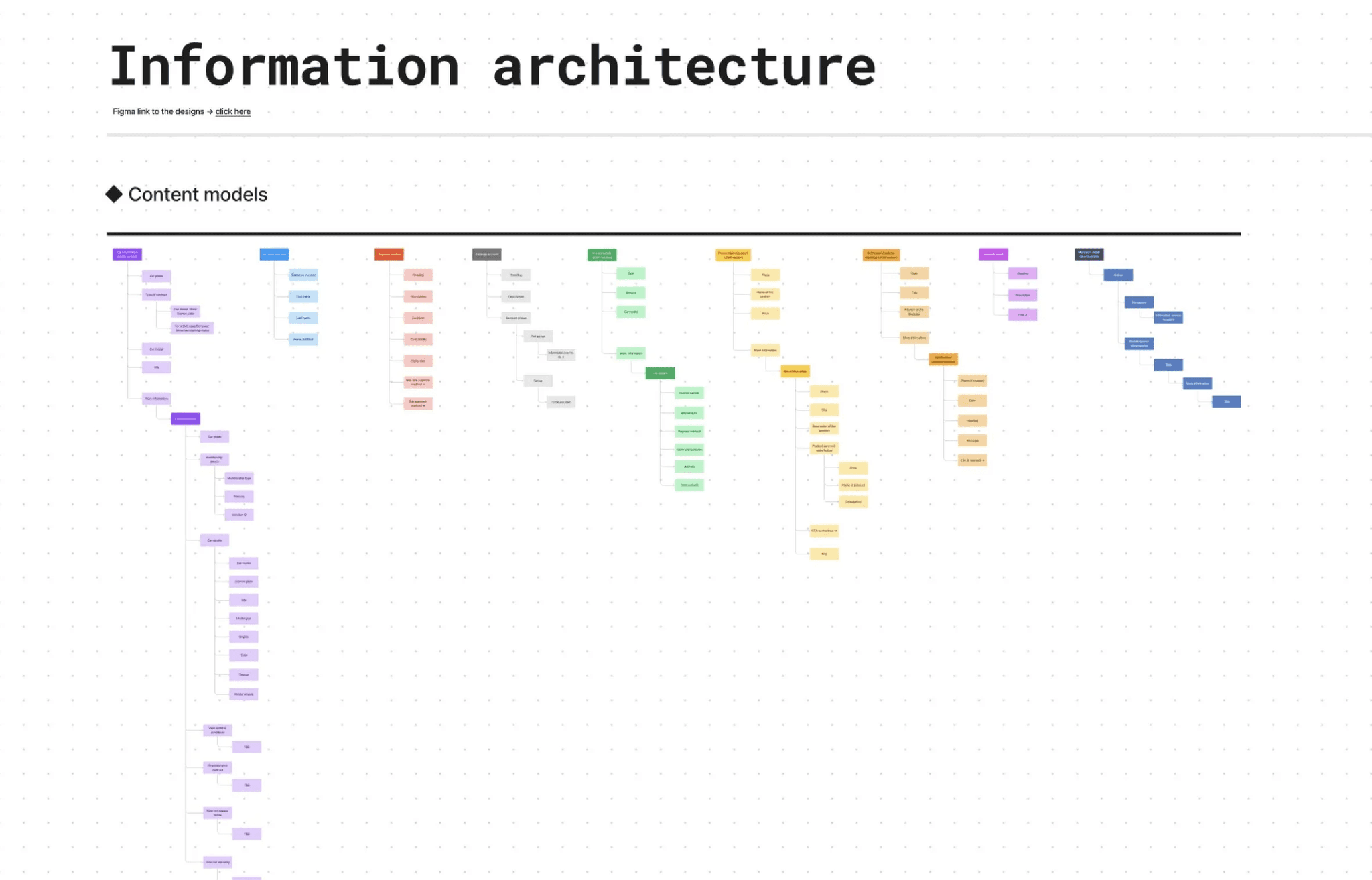
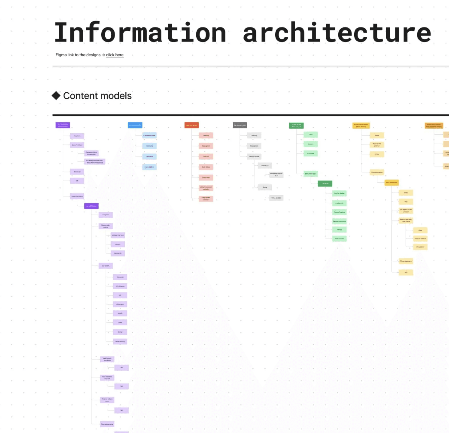
Information architecture snippet

In ideation phase, a combination of low-fidelity and high-fidelity wireframes were made to facilitate effective feedback gathering from the design team and ensure alignment with stakeholders.
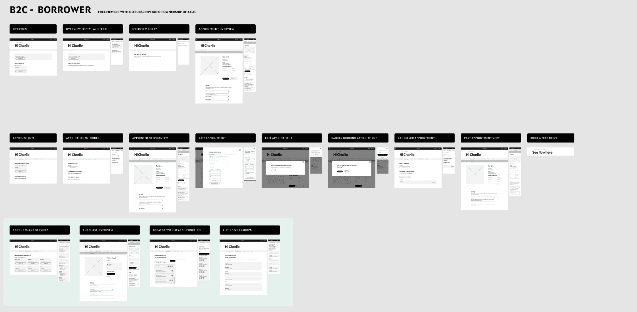
A snippet from the Lo-fi mock-ups file

In testing phase, a combination of low-fidelity and high-fidelity wireframes were made to facilitate effective feedback gathering from the design team and ensure alignment with stakeholders. Key findings include:

1

Horizontal menu has consistently proven to be the more intuitive and usable option

1

Horizontal menu has consistently proven to be the more intuitive and usable option

1

Horizontal menu has consistently proven to be the more intuitive and usable option

2

Users struggled to find information buried deep within the "Car details" section

2

Users struggled to find information buried deep within the "Car details" section

2

Users struggled to find information buried deep within the "Car details" section

3

Users expressed an expectation to receive notifications for new messages in their inbox

3

Users expressed an expectation to receive notifications for new messages in their inbox

3

Users expressed an expectation to receive notifications for new messages in their inbox

After gathering feedback and collaborating with the PM and dev team, we refined the designs.
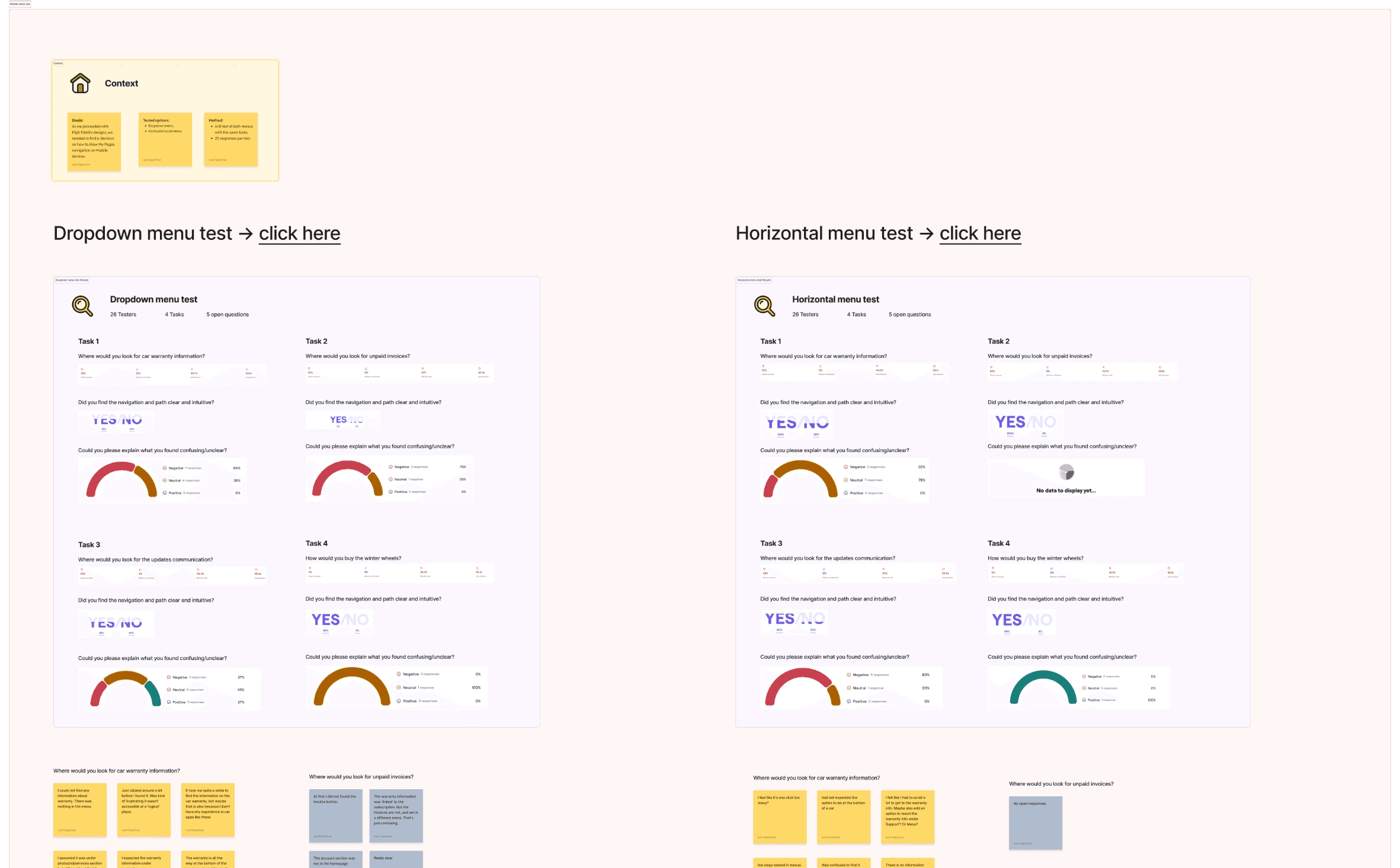
Documented A/B test results

Outcome

We redesigned the navigation based on user expectations revealed during the card sorting exercise. This resulted in a reduction from seven to three primary navigation options, with the remaining items categorized within secondary menus. This approach minimizes the initial menu complexity for users.

To minimize cognitive load, we also revamped the user profile interface. This included reducing visual clutter and implementing a consistent color scheme that aligns with the company's brand website.

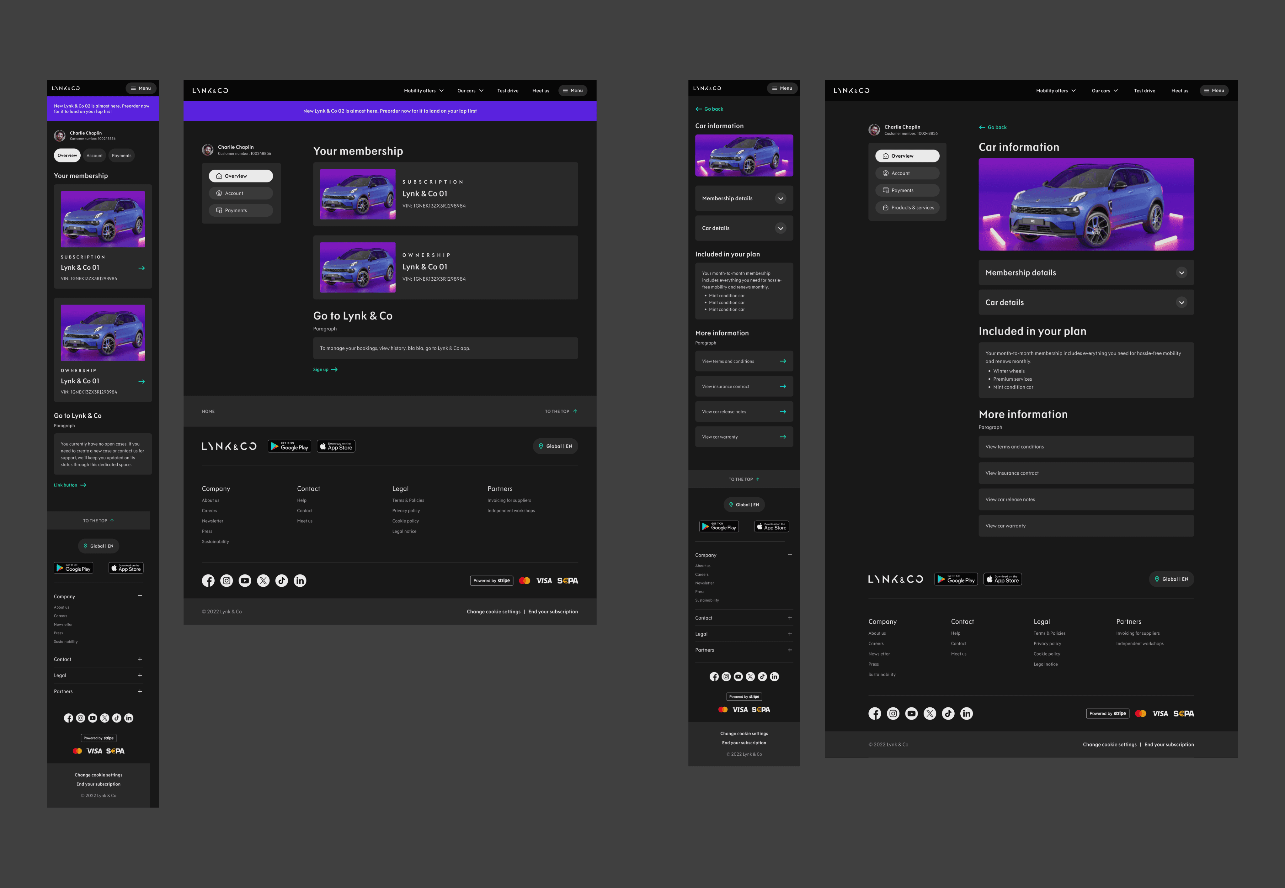
To support the project's focus on modularity, we created a component library for the development team. This library of reusable components empowers site editors to efficiently build new pages and streamline updates to existing ones. These mockups represent the initial stage of the platform update.
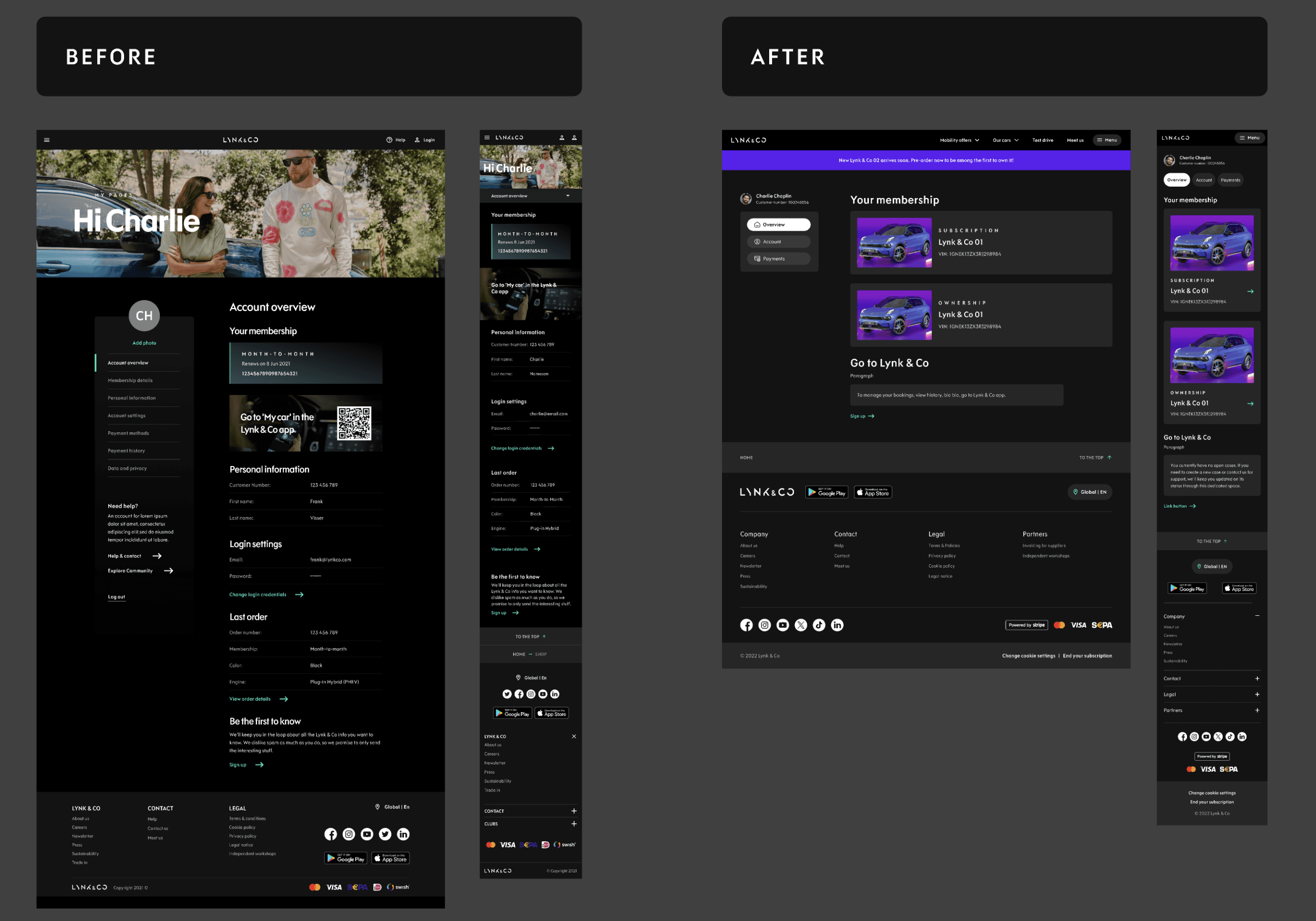
The designs of User profile first view before and after the project
The new design of the first view
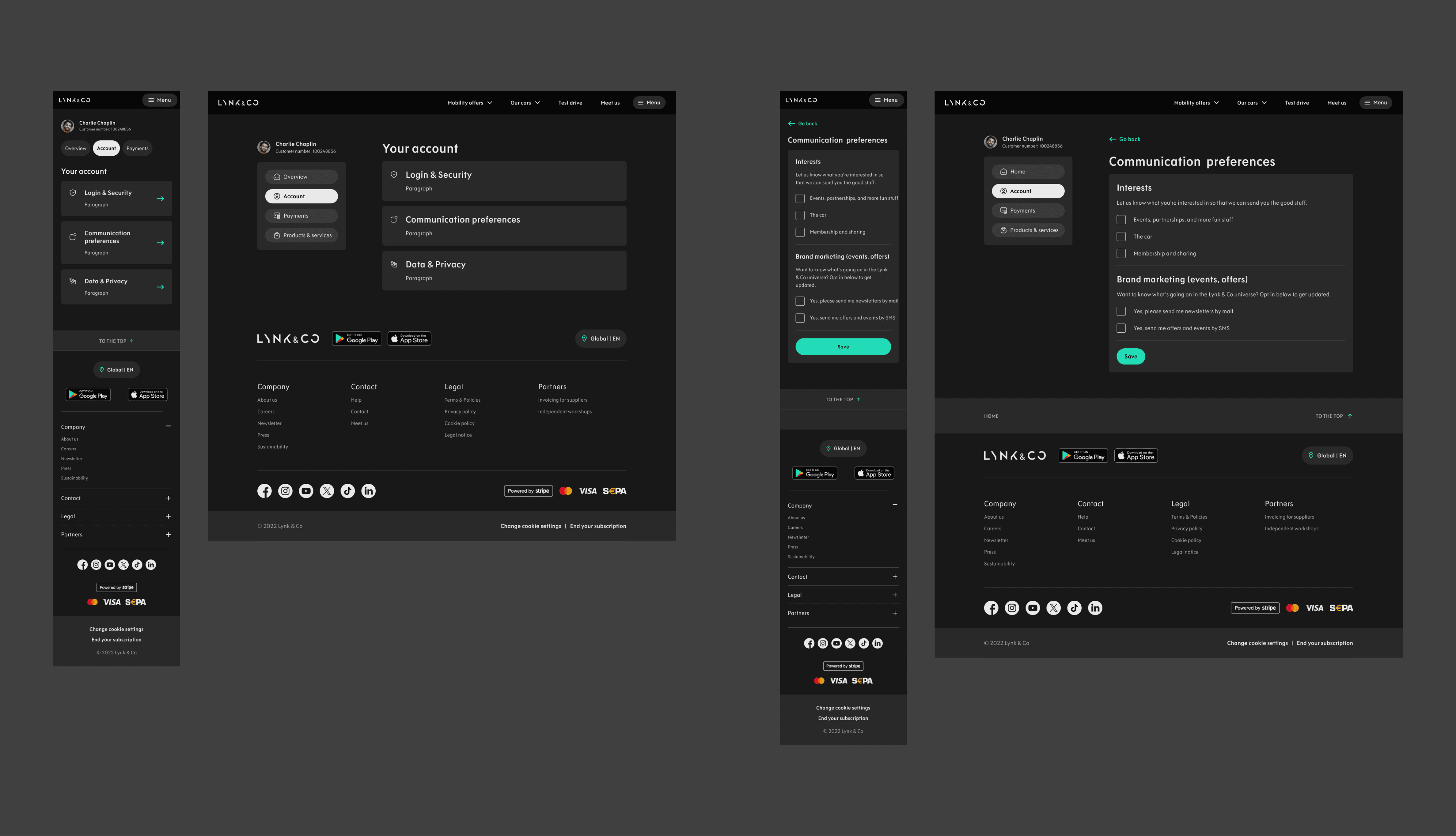
The new design of the "Your account" section
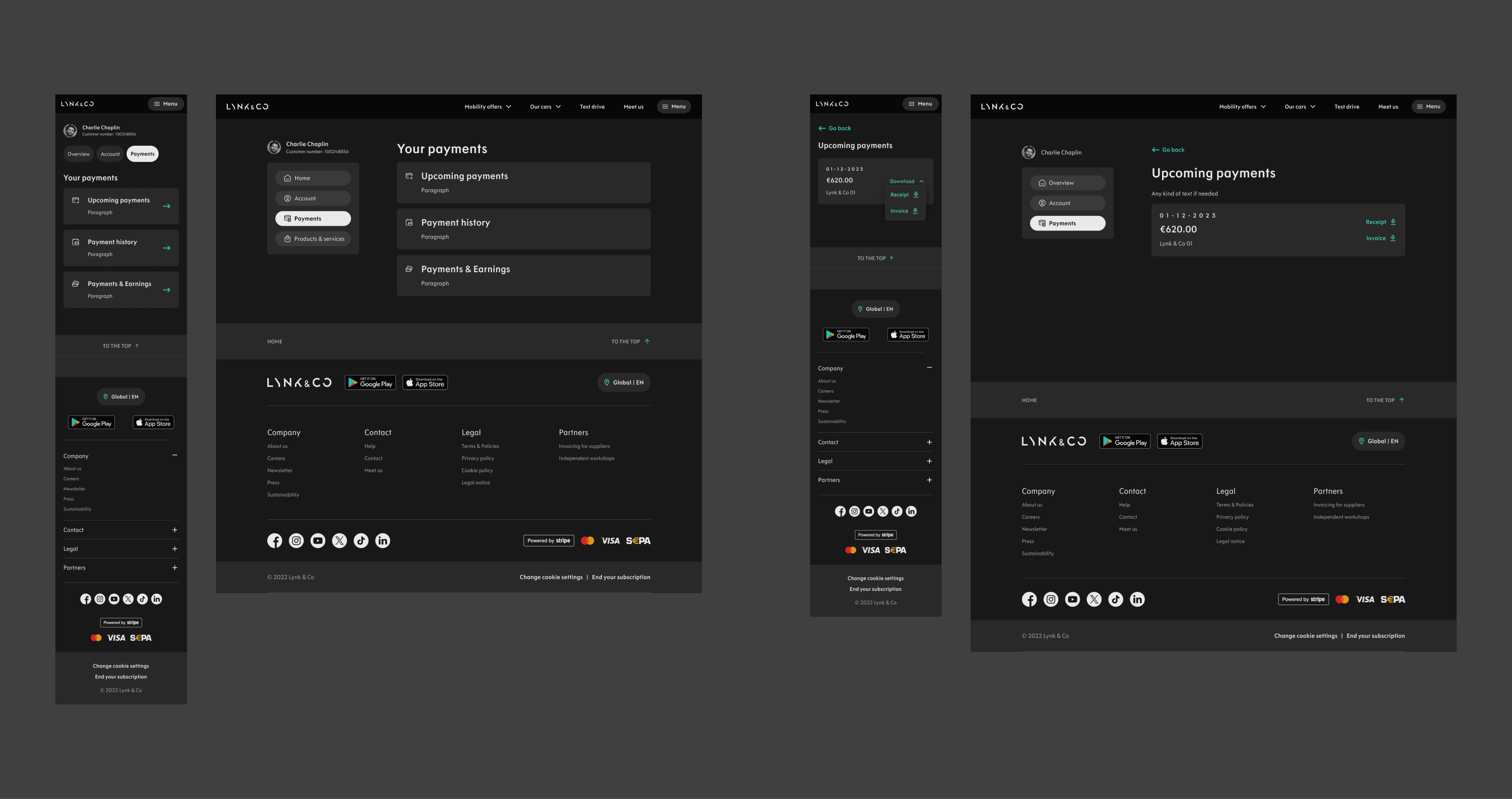
The new design of the "Your payments" section