New look and feel for homepage

New look and feel for homepage

New look and feel for homepage

Main picture
Main picture
Main picture

Timeline

2022 - 2024

Role

UX/UI Designer

Background

When I joined the company, I was assigned to a project called the "Refresh Project." Lynk & Co, an agency, was involved in the initial stages of the project. Main takeaways were:

1

To align the company's website with our clubs.

1

To align the company's website with our clubs.

1

To align the company's website with our clubs.

2

To introduce a new brand colours.

2

To introduce a new brand colours.

2

To introduce a new brand colours.

3

To introduce patterns that can be found in clubs

3

To introduce patterns that can be found in clubs

3

To introduce patterns that can be found in clubs

4

To introduce thinner fonts

4

To introduce thinner fonts

4

To introduce thinner fonts

Concept & creation

After reviewing the brief and mockups from the agency, we explored various directions. We implemented a new grid system, because of the issues in past development and users reviews.


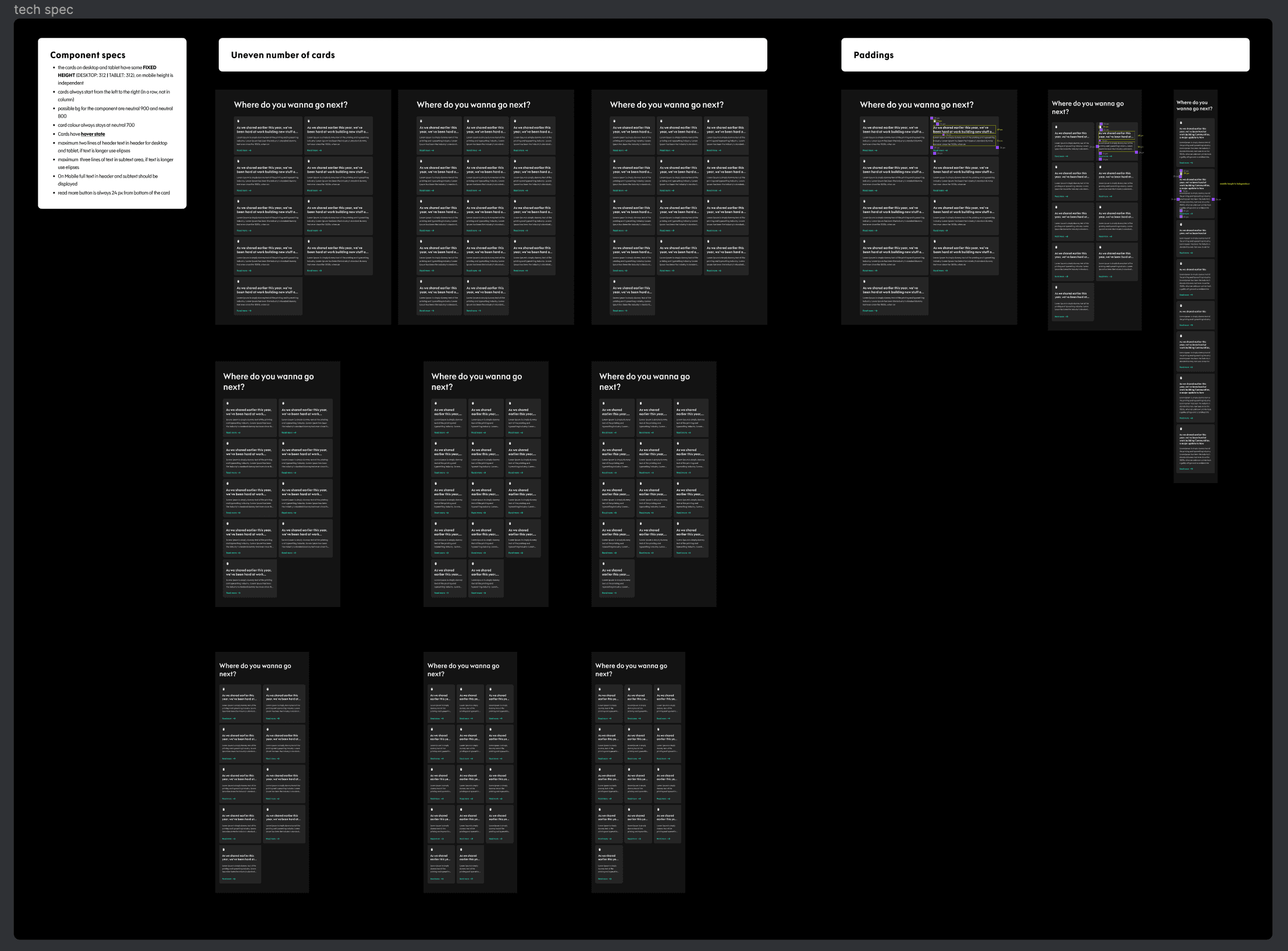
From my previous experience at T-Mobile Poland, I suggested using a framework to structure our work in a more manageable way for updating the components (at least 63 components from just one of our design systems, we had 4 in total). We used a SLC Framework (Simple Lovable and Complete).
SLC Framework

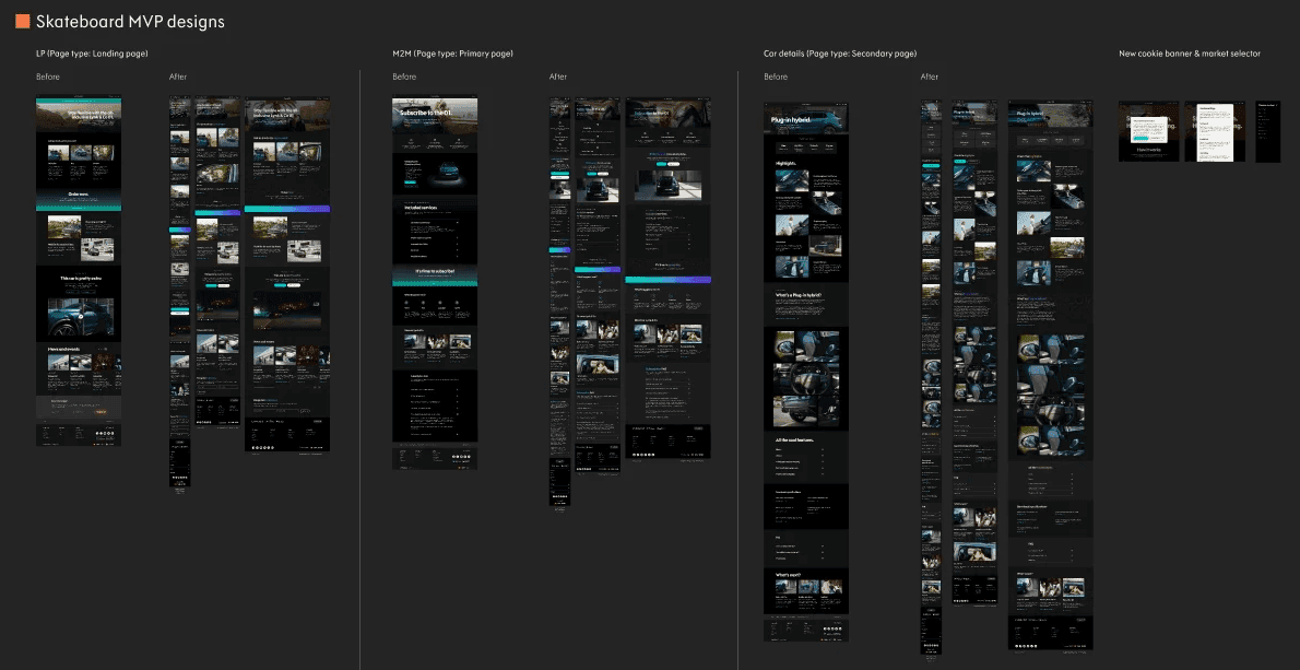
Then, we identified and updated the most critical components that needed to be changed while ensuring compatibility with the ones already implemented. We created a list of must-have and nice-to-have components. We then designed how these changes would impact our look and feel, ensuring that we had something to present to our stakeholders.

MVP Designs

We developed Brand Web Design System 2.0 and commenced the process of creating new components while updating the existing ones. We structured our design system into four categories, which are:
1

General

This category includes new colours, typography, grid and paddings, patterns, and other similar elements.

1

General

This category includes new colours, typography, grid and paddings, patterns, and other similar elements.

1

General

This category includes new colours, typography, grid and paddings, patterns, and other similar elements.

2

Objects

In this category, we have various components such as CTAs, checkboxes, drop-downs, input fields, etc.

2

Objects

In this category, we have various components such as CTAs, checkboxes, drop-downs, input fields, etc.

2

Objects

In this category, we have various components such as CTAs, checkboxes, drop-downs, input fields, etc.

3

Global components

This category includes components such as the header, footer, navigation menu, content modal, and other elements that are consistent throughout the website.

3

Global components

This category includes components such as the header, footer, navigation menu, content modal, and other elements that are consistent throughout the website.

3

Global components

This category includes components such as the header, footer, navigation menu, content modal, and other elements that are consistent throughout the website.

4

Page components

This category consists of components such as accordions, carousels, tables, and other similar elements.

4

Page components

This category consists of components such as accordions, carousels, tables, and other similar elements.

4

Page components

This category consists of components such as accordions, carousels, tables, and other similar elements.

Design System snippet

Due to the Refresh Project's new colours and specific use of gradients and patterns, we needed to establish guidelines on how people should use them to ensure that the experience was consistent. To achieve this, we organised meetings with individuals from the brand team and digital project management.

Guidelines

Outcome

As we had predicted in the early stages of the project, it turned out to be much bigger than we initially thought. Due to various reasons, such as the limited capacity of dev teams and other projects taking priority, we had to scale down.

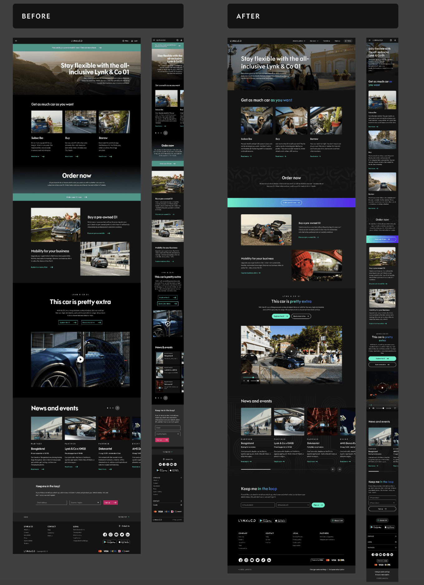
Despite obstacles and changes that we had to implement, we managed to deliver the project on time and give the website, and emails new look&feel by:
1

Changing the typography to thinner fonts

1

Changing the typography to thinner fonts

1

Changing the typography to thinner fonts

2

Lightening the background color palette while still maintaining dark mode

2

Lightening the background color palette while still maintaining dark mode

2

Lightening the background color palette while still maintaining dark mode

3

Adding new colours, gradients, and patterns (found in clubs) to components

3

Adding new colours, gradients, and patterns (found in clubs) to components

3

Adding new colours, gradients, and patterns (found in clubs) to components

4

Moving from an asymmetrical grid to an 8px grid

4

Moving from an asymmetrical grid to an 8px grid

4

Moving from an asymmetrical grid to an 8px grid

5

Creating a new design system with updated/new components and documentation for developers and e-commerce, CRM managers

5

Creating a new design system with updated/new components and documentation for developers and e-commerce, CRM managers

5

Creating a new design system with updated/new components and documentation for developers and e-commerce, CRM managers

6

Providing quality assurance as needed

6

Providing quality assurance as needed

6

Providing quality assurance as needed

Before and after