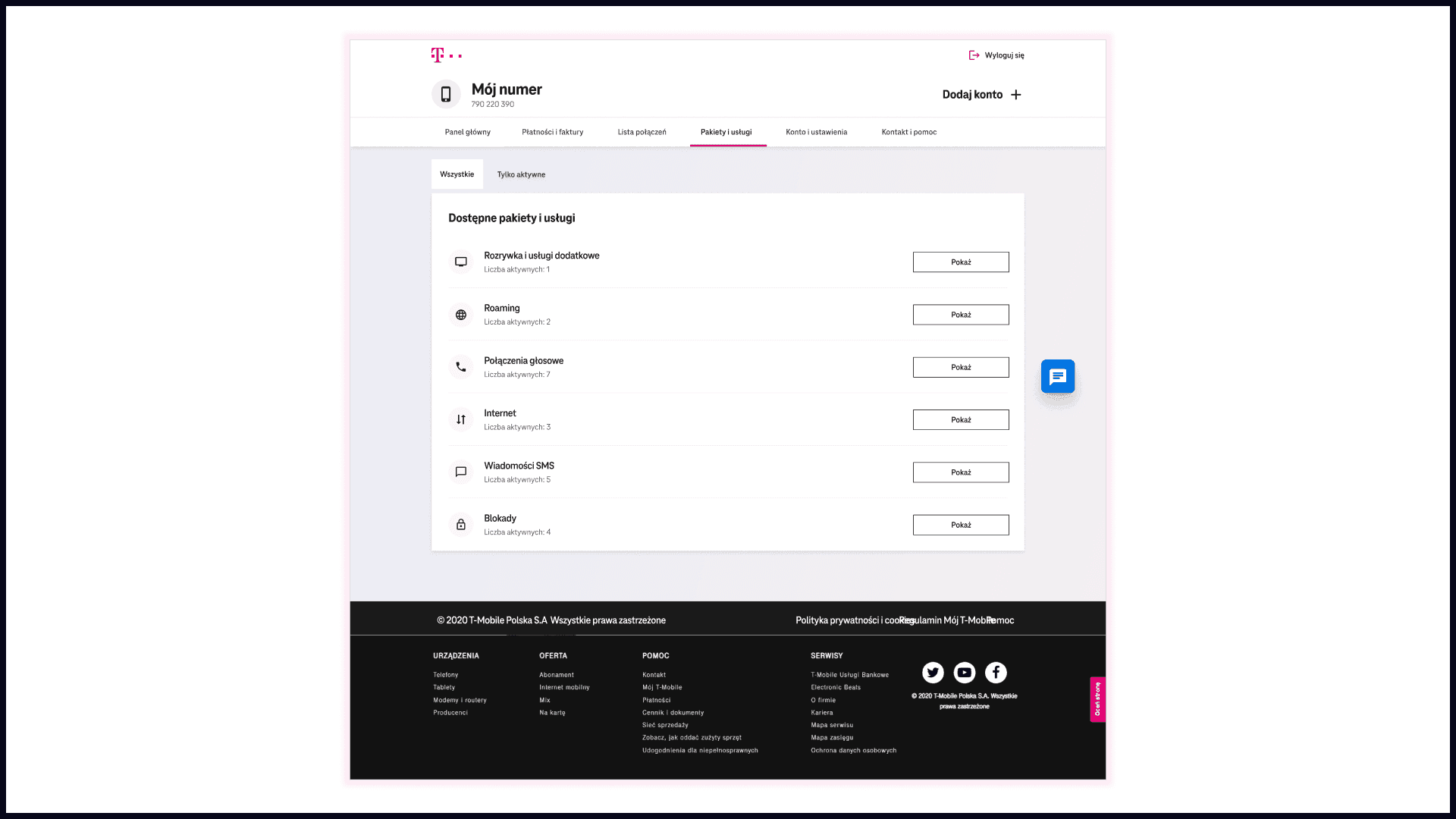
Nowy Mój T-Mobile
Timeline
2021 - 2022
Role
UX/UI Designer
Background
A new service from T-Mobile, in which you can quickly and conveniently manage all your numbers and easily check the status of services, call history, and payments. It can be translated as "My New T-Mobile”.
Add-ons subpage was a critical project since it was one of the few instances where the service could generate revenue for the company. Therefore, it was important for stakeholders, business people, and users who wanted to purchase for example new data packages, Netflix subscriptions, or roaming data.
Reasons for replacement
It replaced the old service due to several factors:
Concept & creation
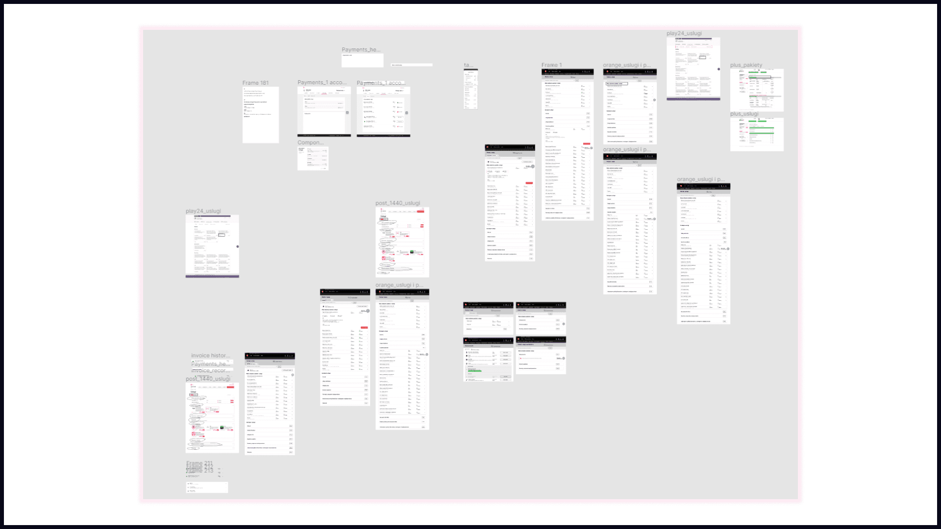
We began by comparing our service to that of our competitors, namely Plus, Play, and Orange. We also drew inspiration from previous web services, noting the things we liked and those that would not work.
After completing the initial work, we began creating hi-fi mockups based on our ideas for functionality and aesthetics. We produced several different variants, some of which are shown below. We then held a meeting to discuss and select two different designs that differed in appearance. These two designs were then used for internal user testing.
After selecting two different designs, I created prototypes of them in Figma. Then, I sent the Figma prototype link on Teams with a question and a task. Here is the exact task that was given to our users: "The task is to activate the package 'Roaming Internet UE 1 GB'. Let me know which version appeals to you more and why. What was better for you?".

Once we received the results from the participants, we created a table to compare the number of people who preferred version A versus version B. We proceeded to create another table with two columns for A and B, and under each column, we added a plus and minus sign to indicate what people liked and disliked about each version. From our research we learnt that:
After completing our analysis, we made changes to the design. Then we were ready to hand off the designs to the developers. We designed for four different viewports and provided prototypes for any longer flows or animations we wanted. We also made sure to cover all possible cases, including focus modes and error states.
After developer updates, I performed UI checks in Figma, logging issues and notifying relevant parties via Teams for minor fixes. Major issues were documented in Figma for developer reference.

End result
Overall, I believe we did a great job. We were able to address and improve all issues that arose during our internal user tests. However, if I had to choose one thing that could have gone differently, it would be the time we spent obtaining data from our backend developers and analysts. This was mainly due to miscommunication issues that we had.

Let's connect
Send me an email
Say hi on LinkedIn


